An elegant QR menu for fine dining

Five refined themes (Noir, Ivory, Bordeaux, Emerald and Marble) that feel like part of the experience, not a gadget.

  • Noir
  • Ivory
  • Bordeaux
  • Emerald
  • Marble
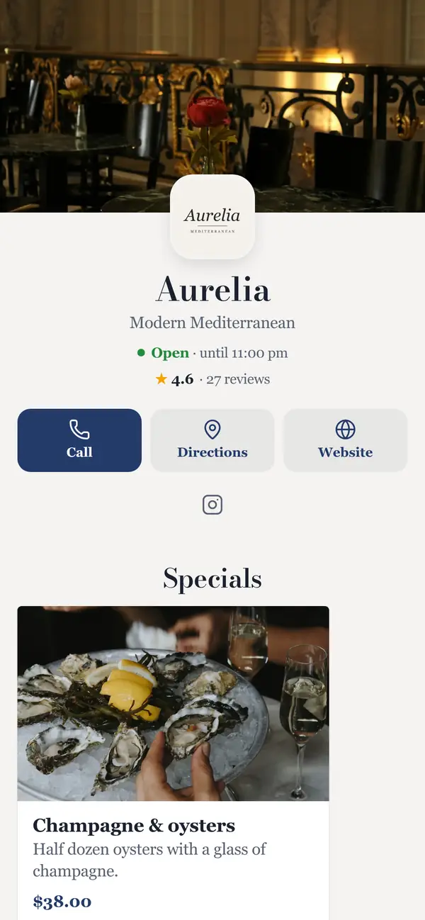
Aurelia: Modern Mediterranean
Aurelia · Marble

In fine dining, the menu is part of the evening. spotmymenu's fine-dining themes use restrained type, generous spacing and dark mode for candle-lit rooms. Present tasting menus, pairings and seasonal courses beautifully, and collect private written feedback that only your team reads.

  • Five refined themes

    Noir, Ivory, Bordeaux, Emerald and Marble, each in light and dark mode.

  • Dark mode for dim rooms

    Follow the guest's phone setting automatically, or force dark for the evening.

  • Tasting menus and pairings

    Present courses, supplements and wine pairings with clear, elegant pricing.

  • Private feedback

    Guests rate service and atmosphere. Written comments stay private to your team.

Fine dining · Menu examples

Menus with their own personality

Same platform, completely different menus. Pick a restaurant to see its theme, colors and the design choices behind it.

4 examples · 4 themes · 4 color schemes

Aurelia, Marble theme

Aurelia

“Modern Mediterranean”

Theme
Marble
Layout
List: compact, great for long menus
Accent
Theme default

Why it works

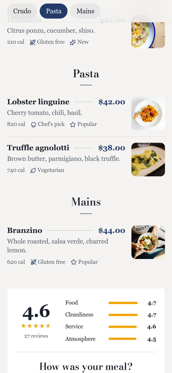
  • Right-aligned prices with dotted leaders: classic menu typography, on a phone.
  • The rating card (4.6 overall, with food, service, cleanliness and atmosphere) builds trust before ordering.
  • “How was your meal?” invites private feedback right after dessert.

Themes aren't tied to a cuisine

Copper Kettle Brewing runs on the BBQ Smokehouse theme. Morning Ritual Café uses the fine-dining Ivory theme. Hickory Hollow smokes brisket on Modern. Pick the look that fits your concept, then make it yours with an accent color.

Example restaurants are fictional. The menus are real spotmymenu menus.

Best practices

Menu design tips for fine dining

  1. 01

    Say less, better

    Three ingredients per description, the ones that matter. Restraint reads as confidence.

  2. 02

    Use classic menu typography

    Serif type, right-aligned prices and dotted leaders. The fine-dining themes do this for you.

  3. 03

    Put wine on the same menu

    Wine by the glass one tap from the food makes pairing effortless and lifts the check.

  4. 04

    Sell experiences as specials

    Tasting menus and wine dinners, with a clear price and exactly what's included.

  5. 05

    Dark mode for dim rooms

    A bright white screen breaks the mood. Dark mode keeps the menu readable by candlelight.

  6. 06

    Show ratings only when they help

    A strong score builds trust. Written feedback stays private, so you hear everything without it going public.

A menu structure that works

Start here and adapt. Short sections with clear names make the sticky section bar easy to use.

  1. 1To start
  2. 2Crudo
  3. 3Pasta
  4. 4Mains
  5. 5Desserts
  6. 6Wine by the glass

Specials ideas

Put these at the top of your menu and schedule them to appear on the right days.

  • Chef's tasting menu
  • Monthly wine dinner
  • Harvest menu
  • Chef's counter
  • Champagne & oysters

FAQ

Will a QR menu feel too casual for fine dining?

Our fine-dining themes are designed to feel like printed stationery: restrained type, generous spacing and a dark mode suited to low light.

Are reviews shown publicly?

Only if you choose. Written feedback is always private; star ratings on the menu are optional.

Can I use my brand colour?

Yes. Add an accent colour to any theme. Every theme meets WCAG AA contrast in light and dark mode.

Your new menu could be live tonight.

7 days free. Set up in minutes. Cancel anytime.

Start your free trial

7 days free · then $8.99/mo

Start free